DYME
Brand Concept • Creative Direction • AI Image Direction
(Self-initiated concept)
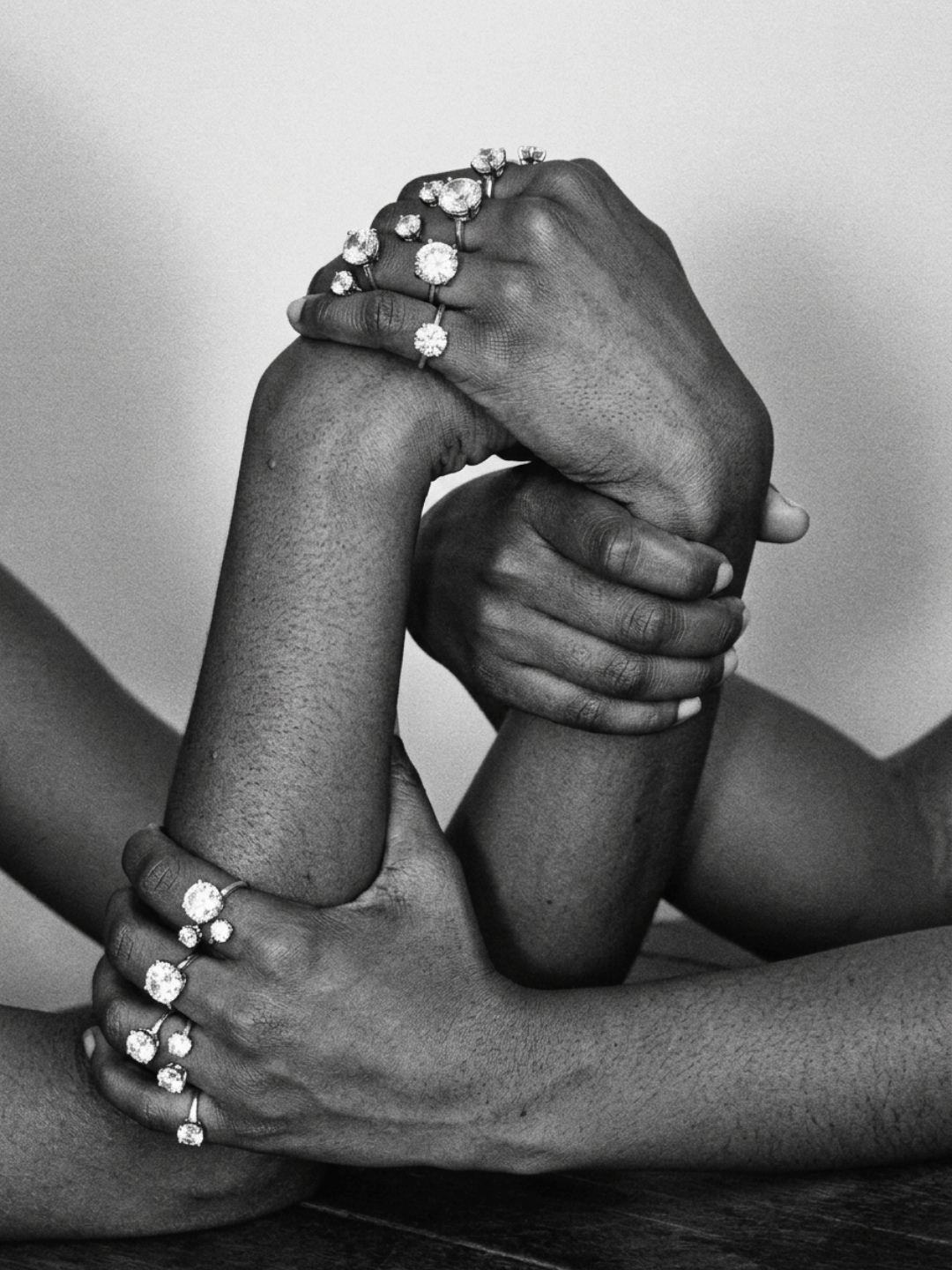
A fictional diamond house. I built it to find out what high jewellery looks like when you take it out of the vitrine.
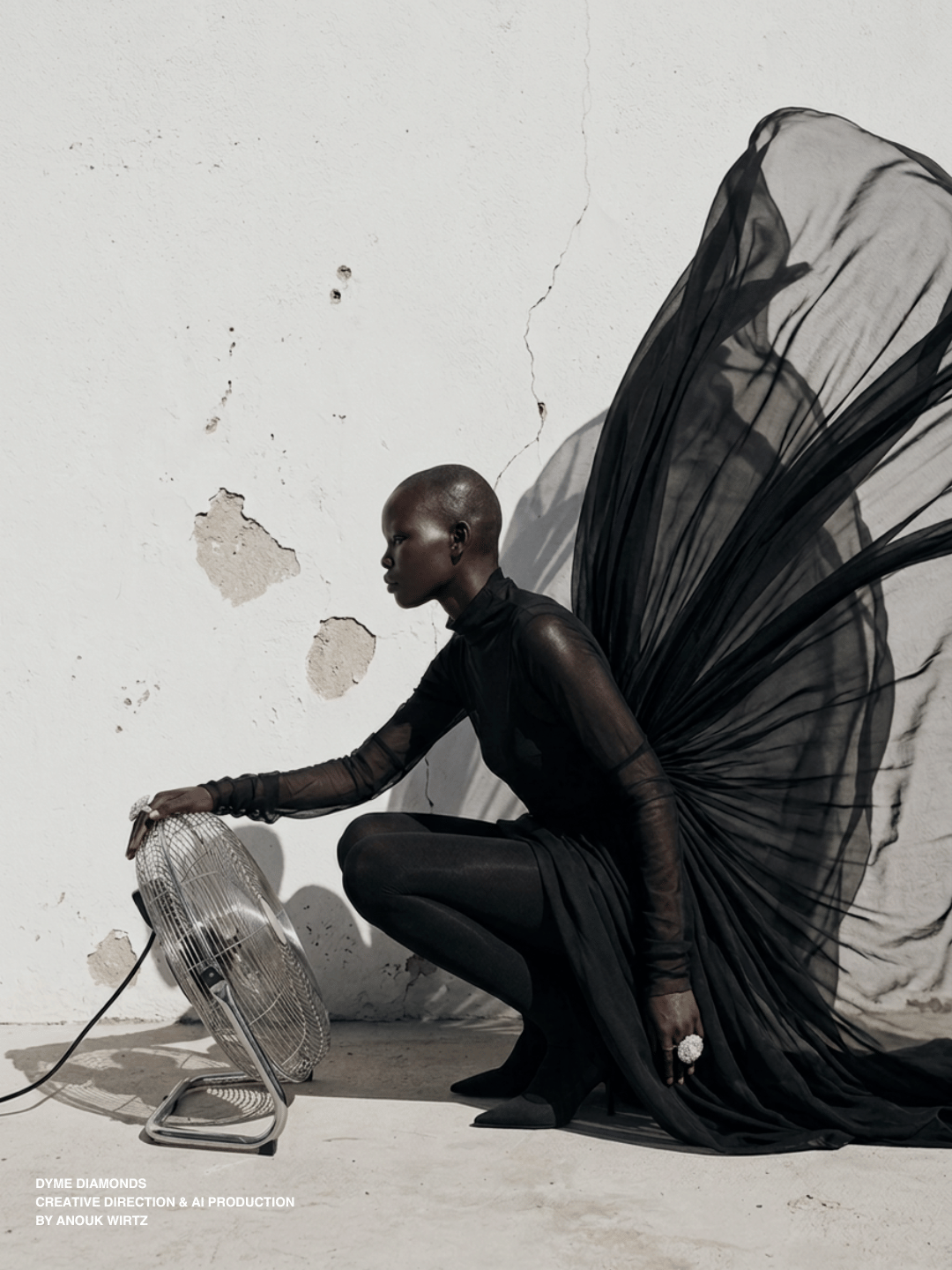
Diamonds are still sold the way they were sold in 1955. Soft focus, a proposal, a promise, a stone photographed like it has never touched a body. I wanted to put them on somebody who has been standing in the heat all afternoon, in a room with a fan on the floor, and see whether they survive it.
(all images are AI generated by me)
Heritage
Reimagined
The Name
A dime is the smallest coin in the pocket. Seventeen millimetres, ten cents, and it is worth more than the coin twice its size.
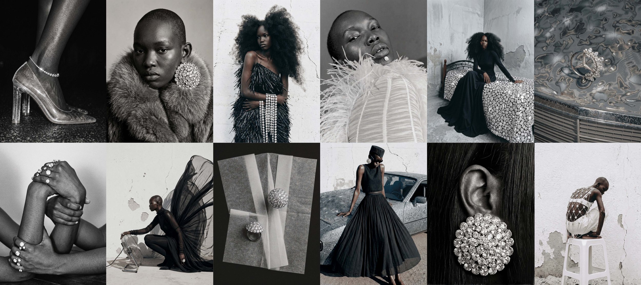
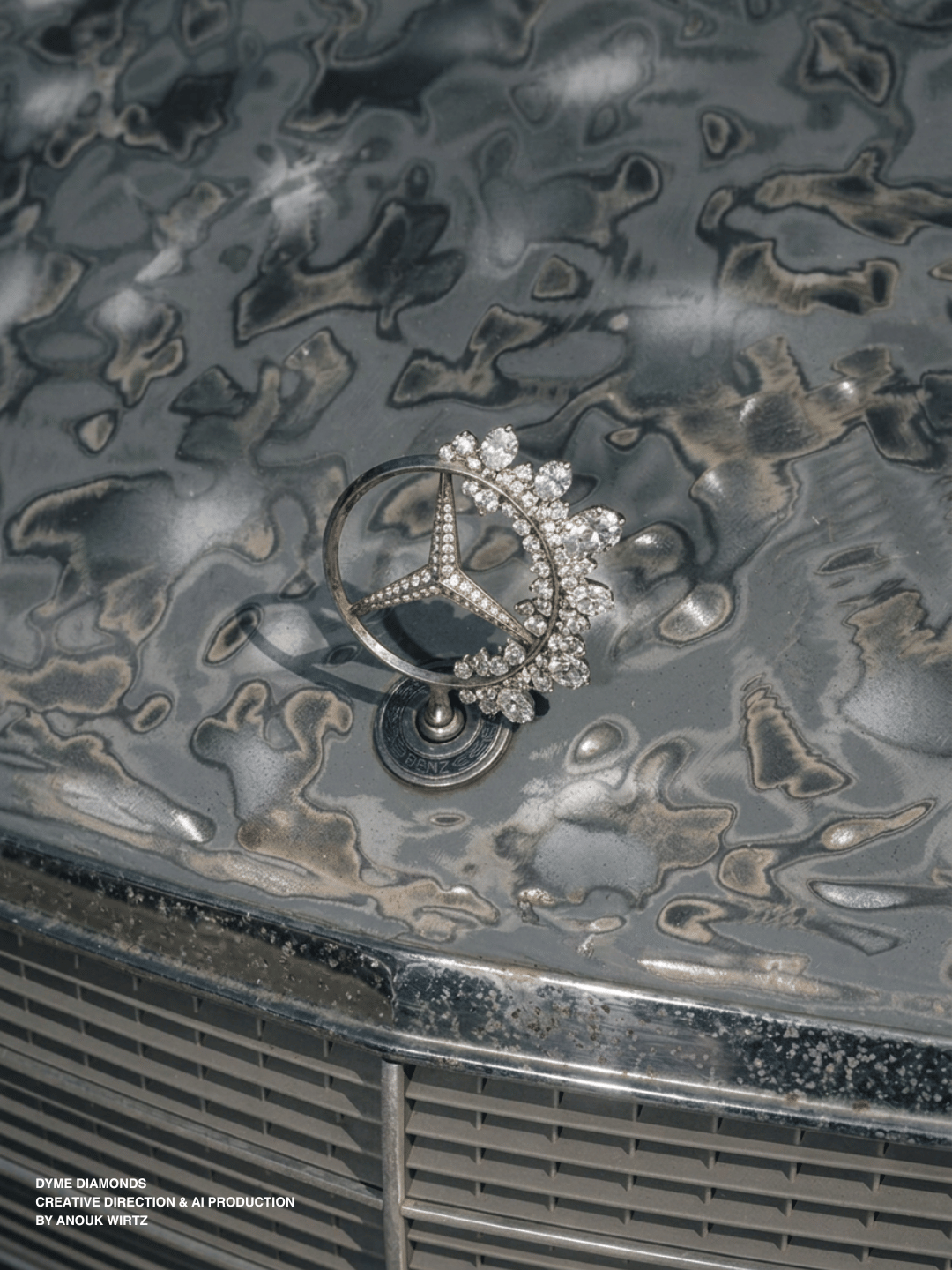
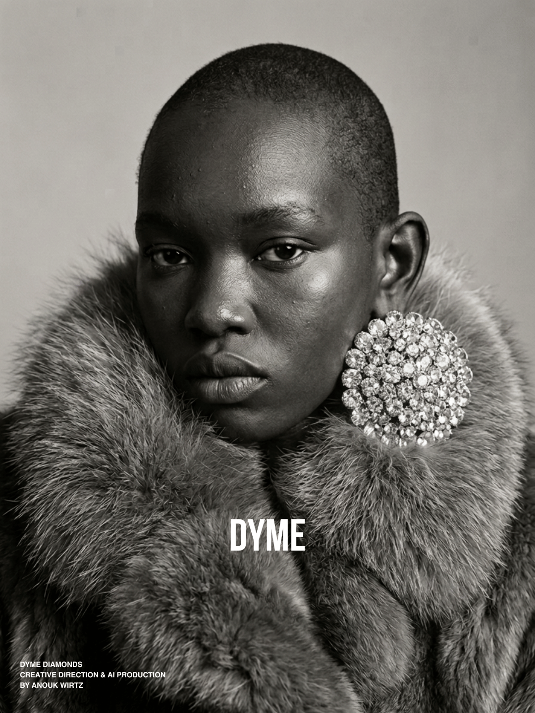
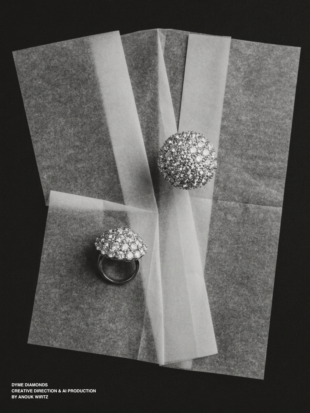
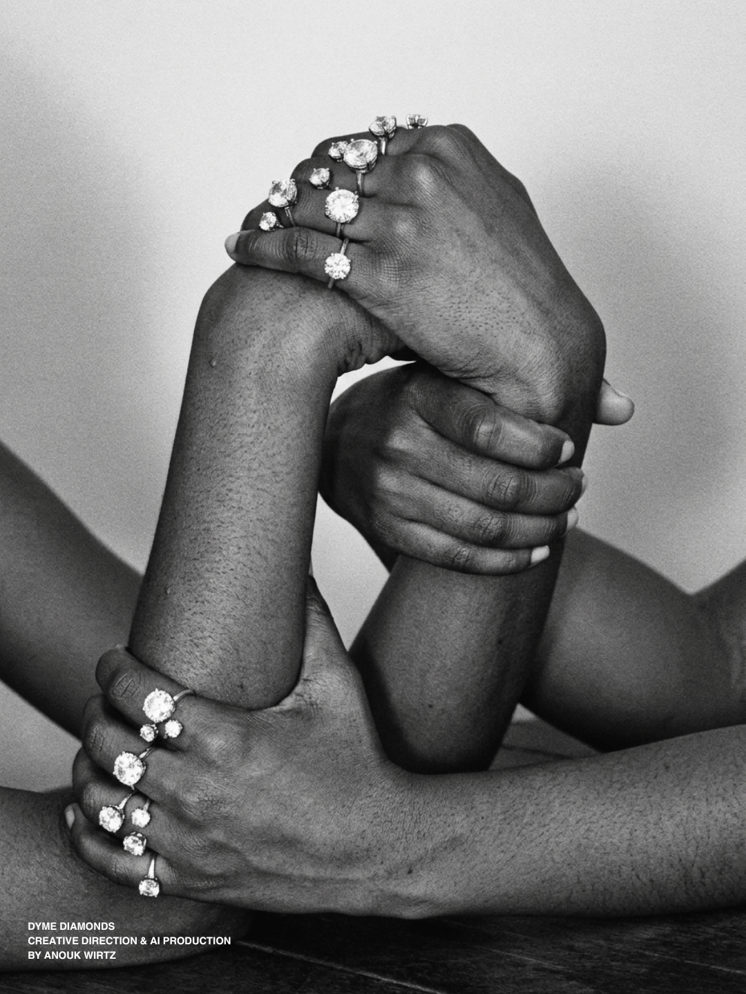
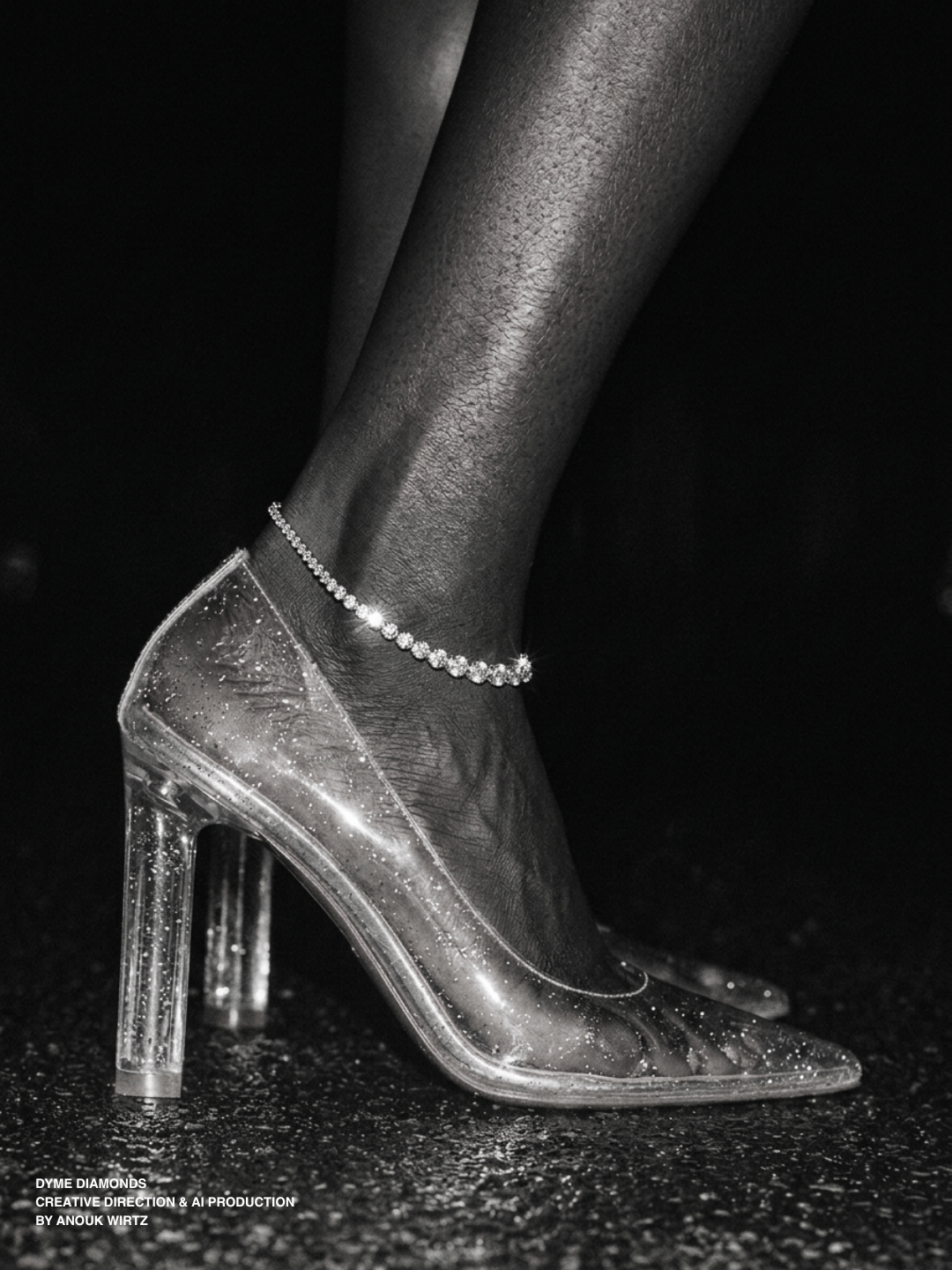
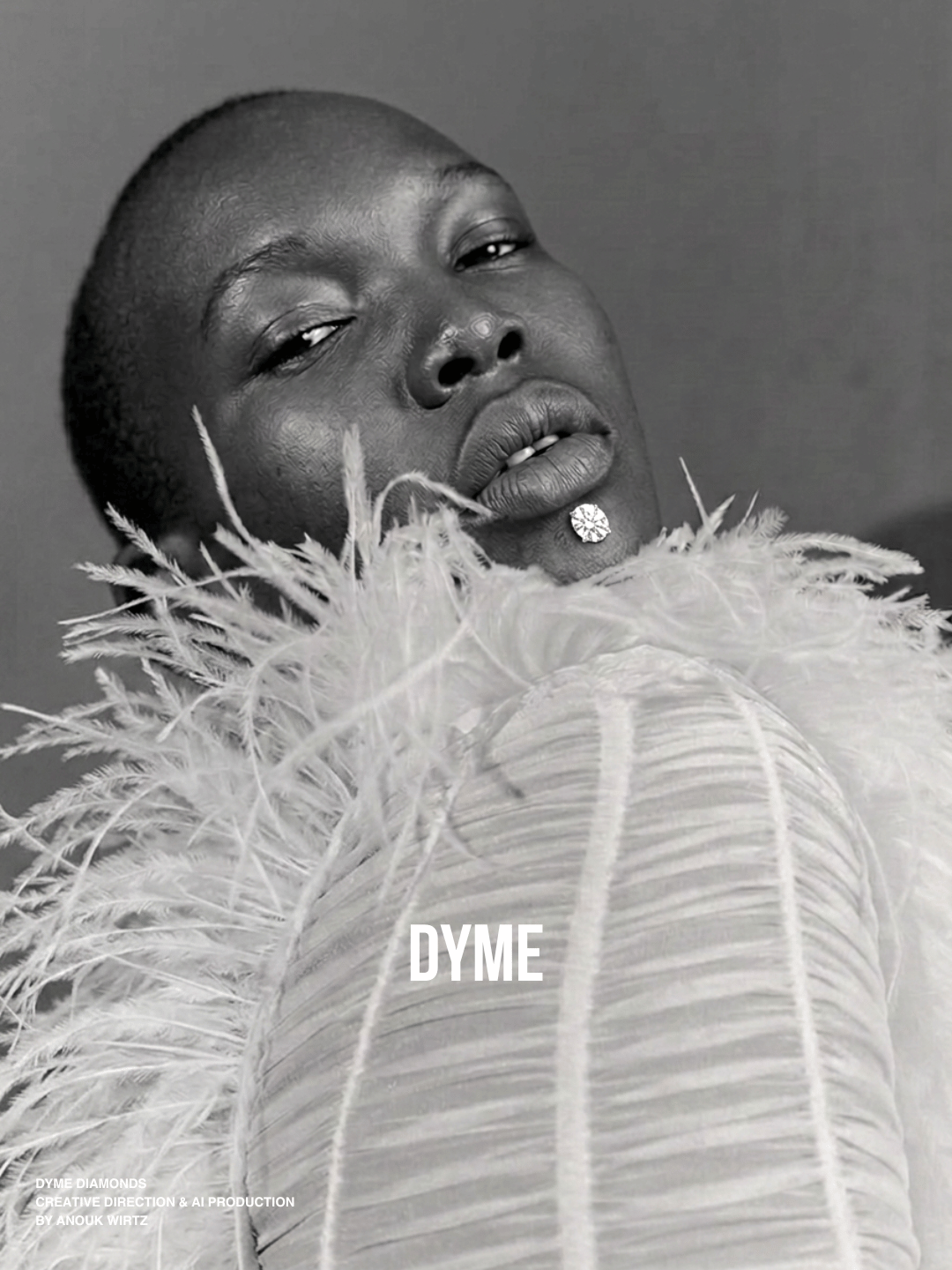
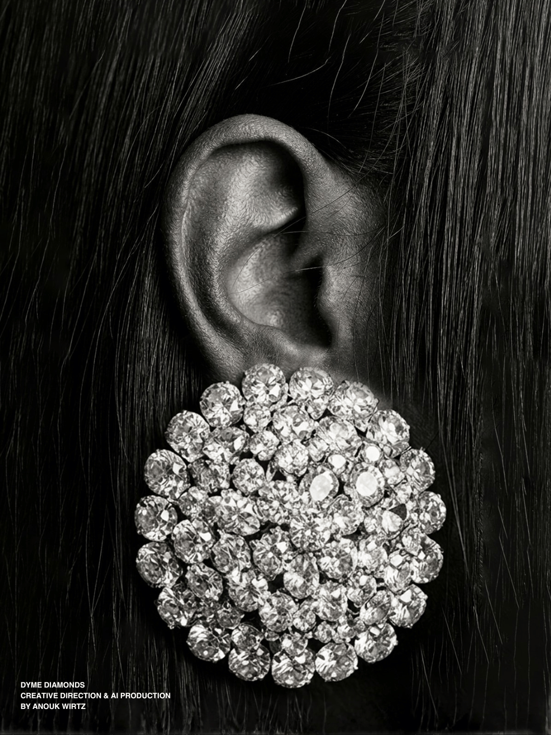
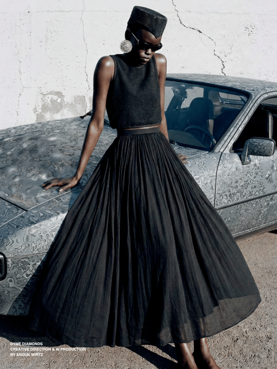
DYME makes nothing small. The pieces are oversized to the point of absurdity: clusters that cover an ear, bracelets that reach the knees and diamond rings that are worn on almost each finger. The name is the only modest thing here.
There is a reason dimes have ridged edges. People used to shave slivers of silver off coins, so the ridges were added to make the theft visible. A security measure on ten cents. I like that even ten cents was worth protecting.
The World
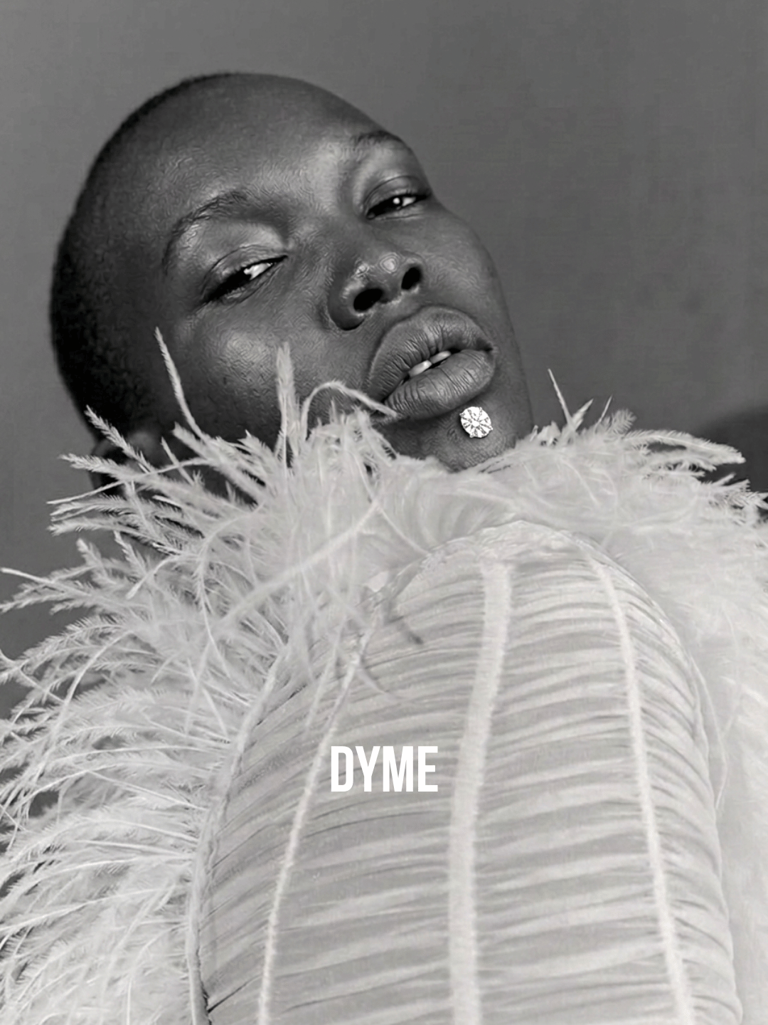
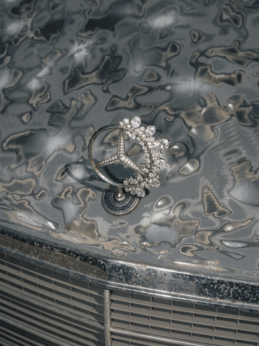
I directed everything in places diamonds usually do not belong. Cracked plaster, bare concrete, a white plastic stool, the bonnet of an old car. The stones are lit like the person wearing them rather than like product.
No heirlooms, no milestones, no proposals. You put the stones on and you go out.



ON THE MAKING
I generated and directed every image myself. No photographer, no crew, no set.
Casting, light, placement and material all got decided in language before anything existed. Then the slow part: holding a frame steady once it was right, changing one thing at a time.
Scale was the other rule. Because the pieces are big, the frames had to be close. A huge cluster on a full-length figure just looks like jewellery. On a cropped ear, with the ear right there for scale, it looks like too much.