AGGE
Brand Concept & Identity • Activation • Creative Direction • AI Image & Video Direction
A fictional skincare house. I built it around the face oil I have been mixing for myself for years.
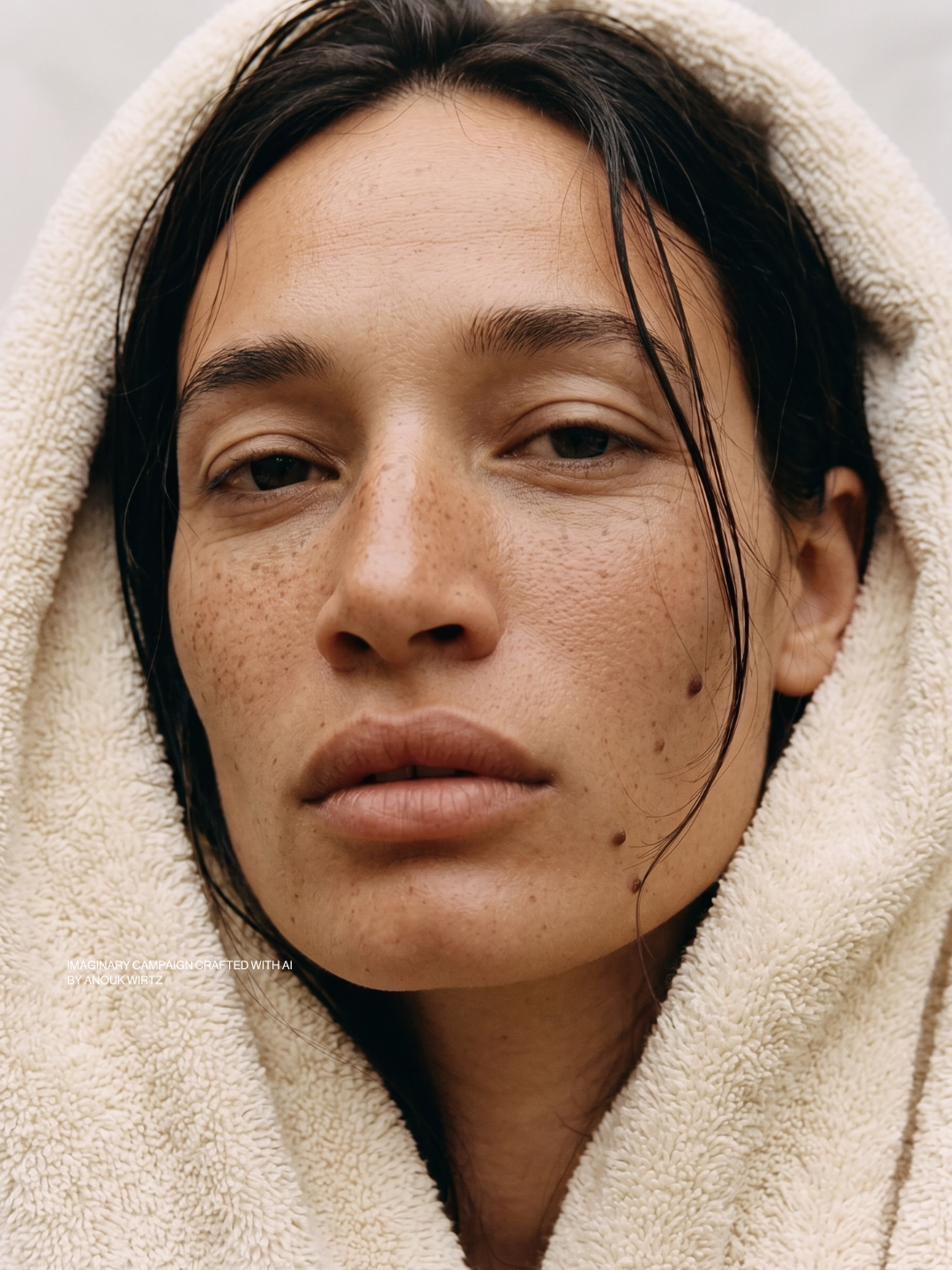
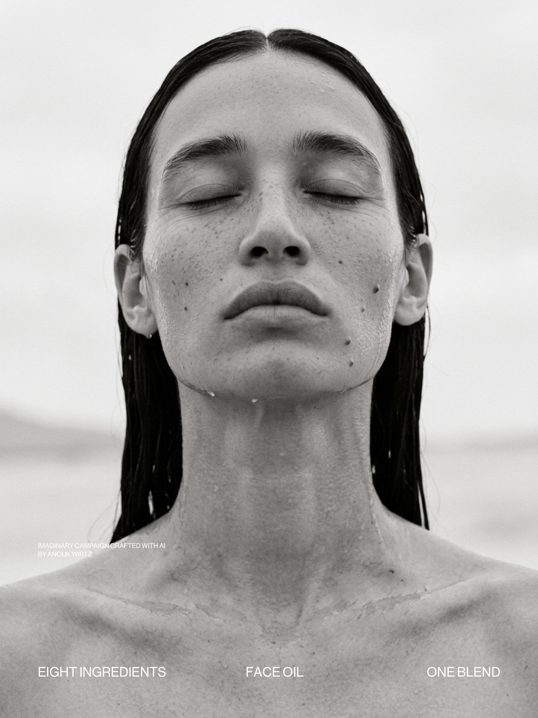
Skincare is sold on correction. Before and after, fewer lines, a face photographed as if it has never been slept in. I wanted to make it for a woman who isn't trying to undo anything, and see whether an oil can be sold on care alone.
(all images & videos are AI generated by me)
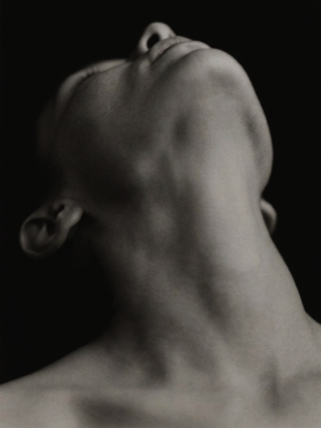
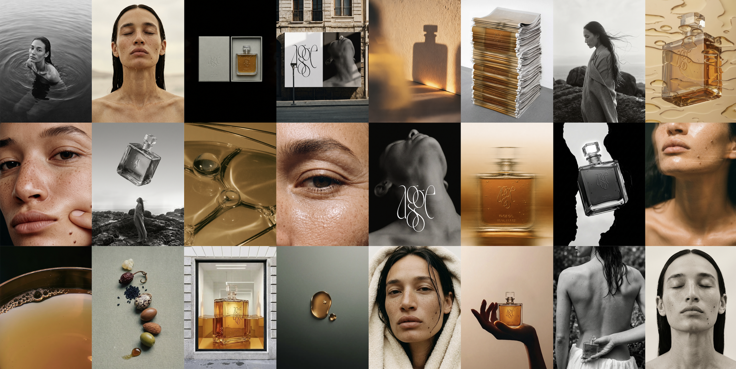
CARE, NOT CORRECTION
The Beginning
Agge didn't start with a lab brief. It started on a bathroom shelf.
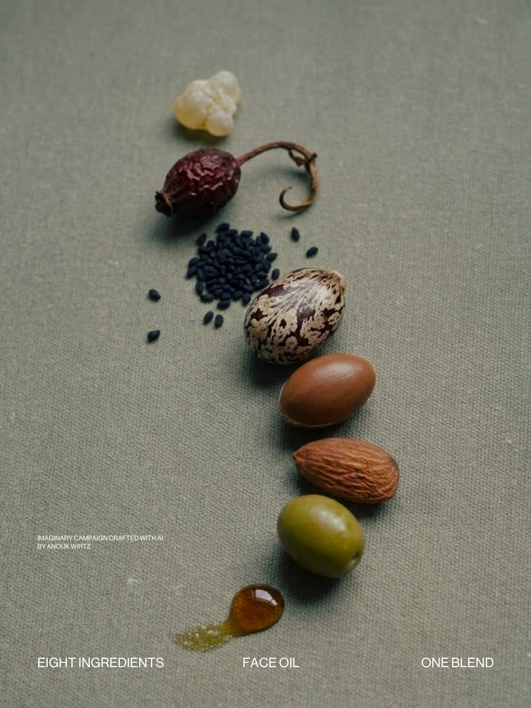
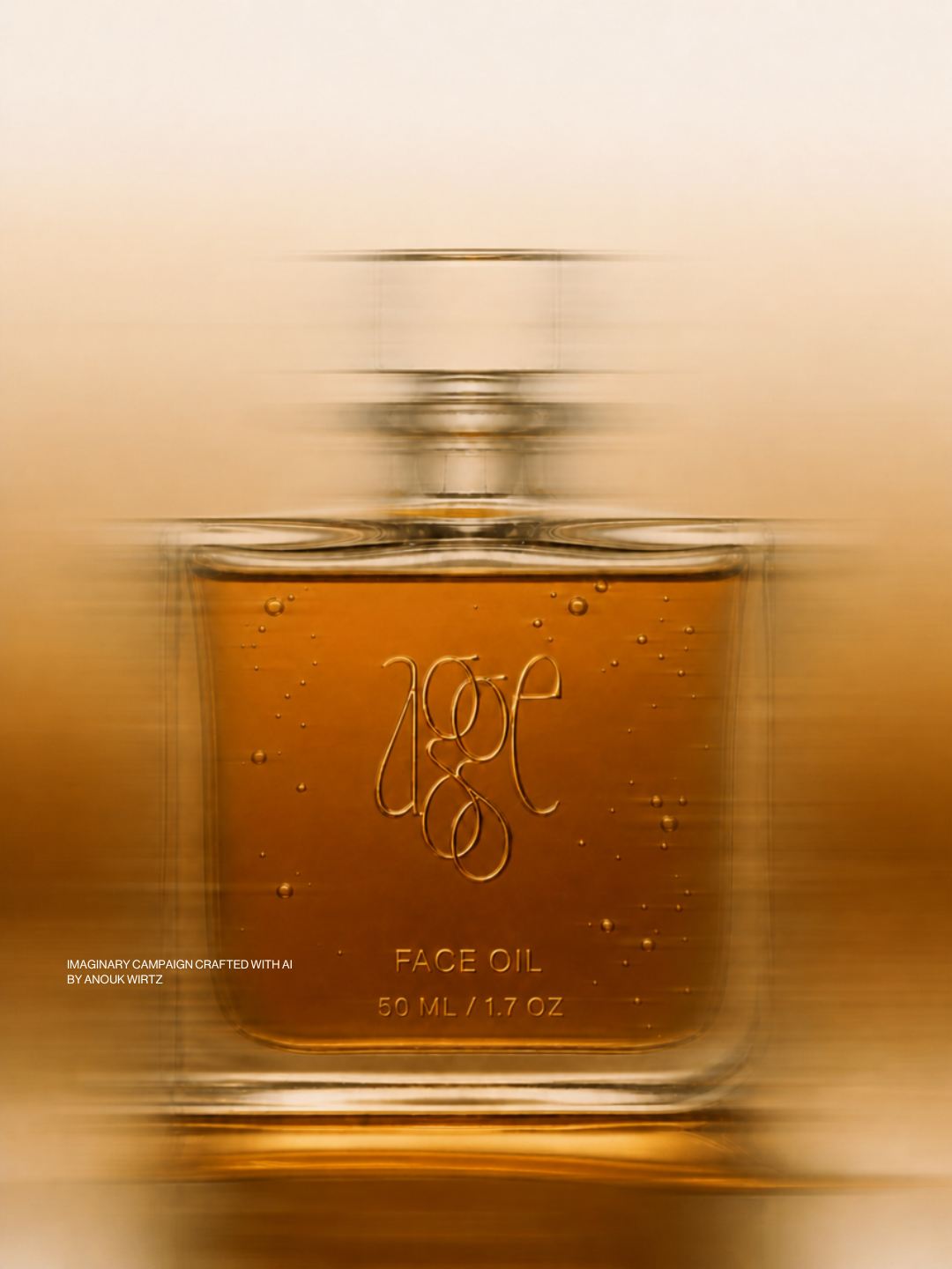
For years I have mixed my own face oil. It settled at eight oils, from seeds, kernels and resin. I kept making it for one reason: it worked better on my face than anything I bought.
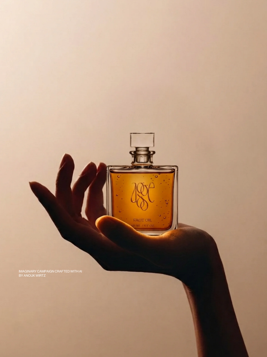
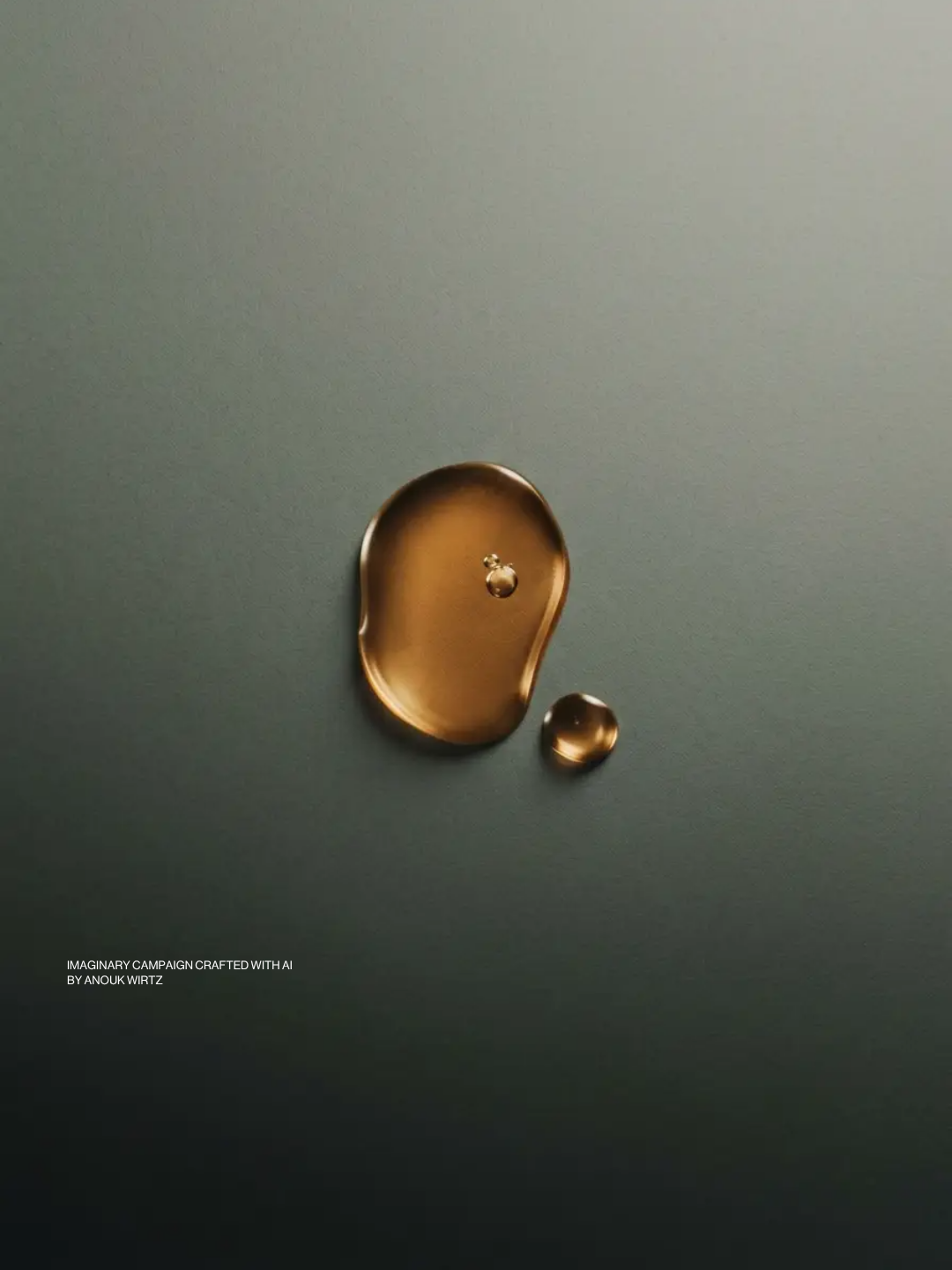
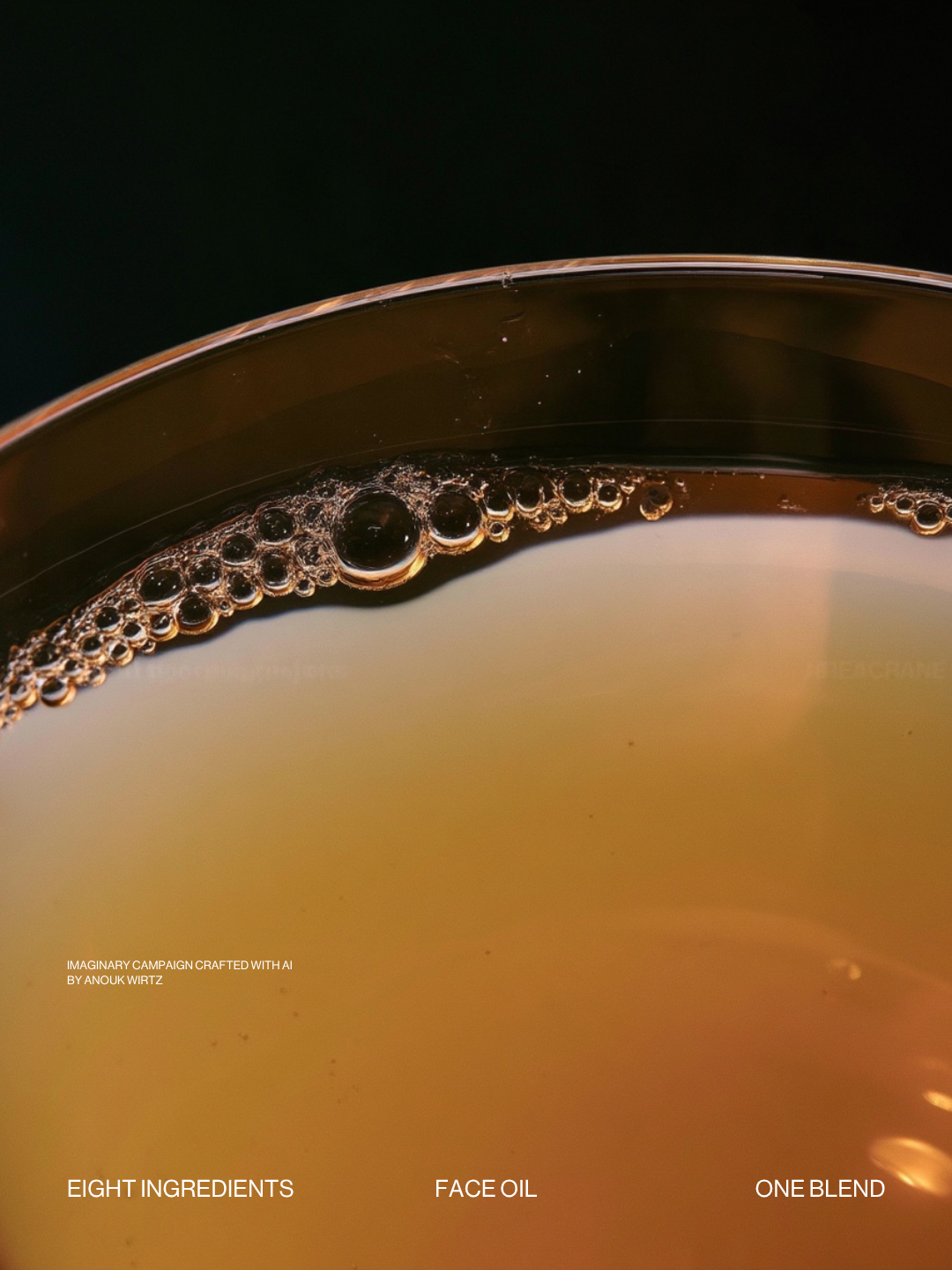
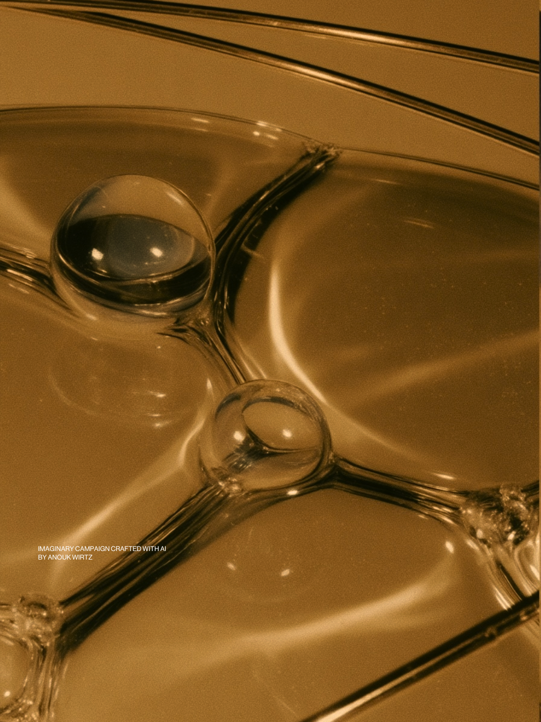
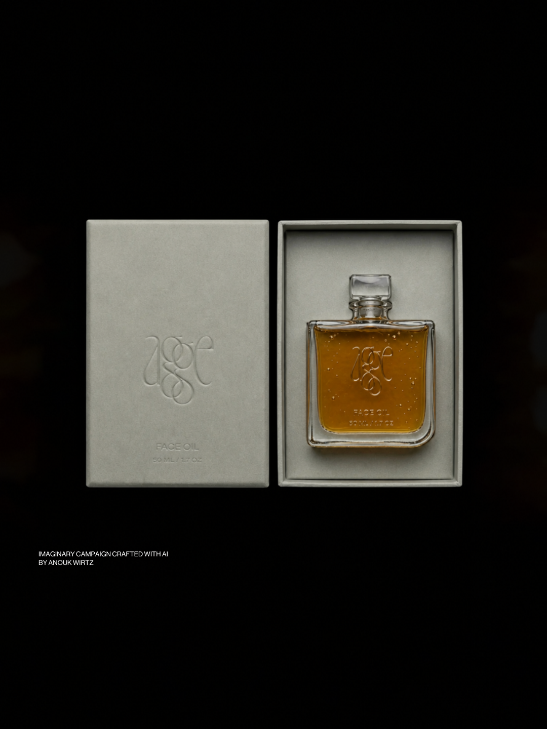
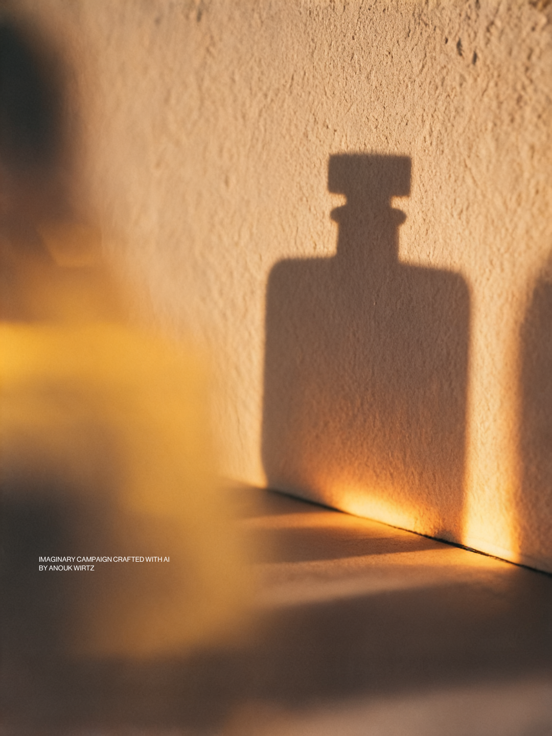
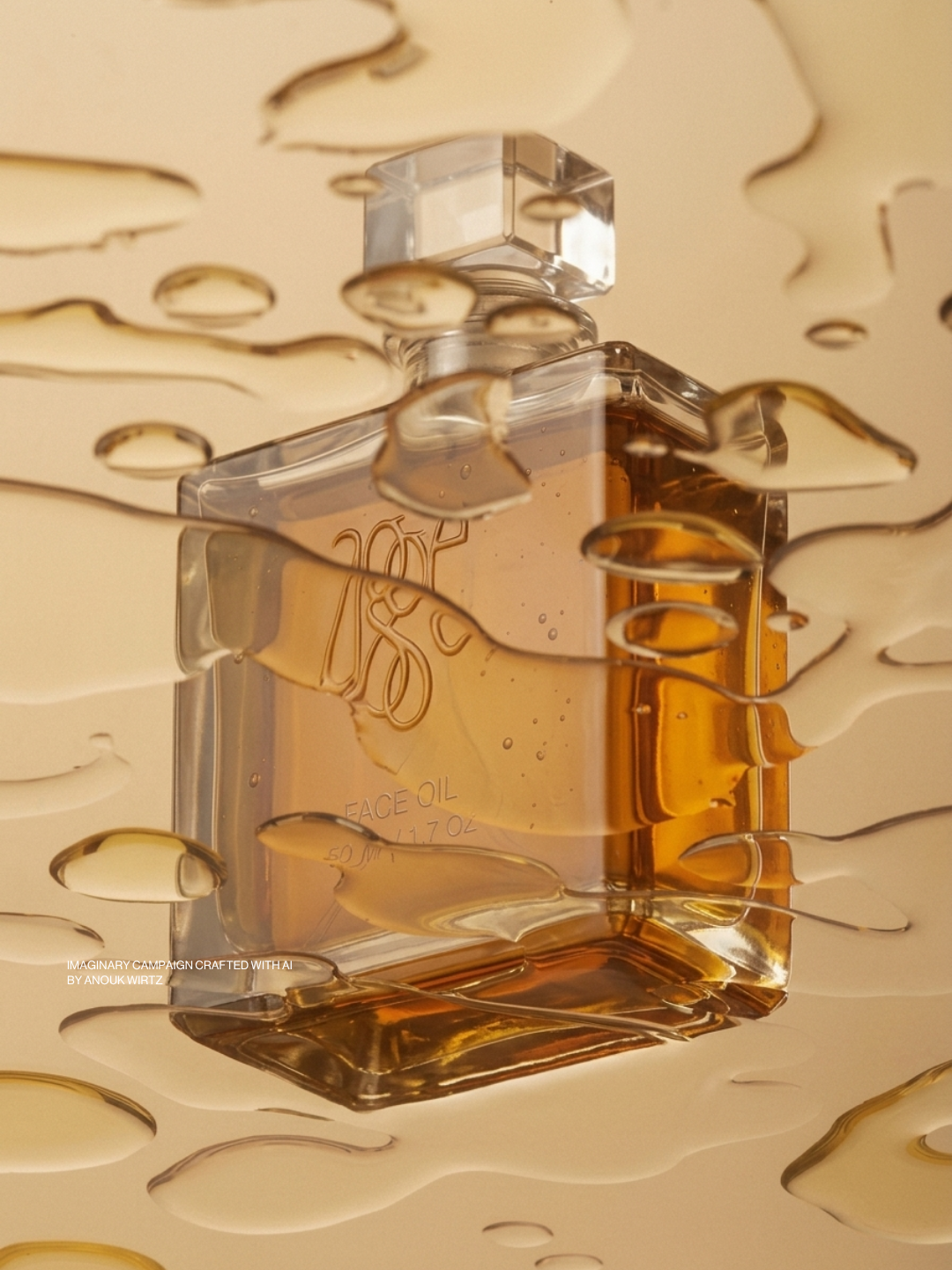
Agge is that bottle, made properly. The amber isn't added. It's the colour the eight make together. It goes on last, after everything else. A few drops, warmed between the palms, pressed in rather than rubbed.
The Name
Agge is spelled like age, with one more g. Most skincare treats that word as something to undo, as if age is something to fight. Agge kept it, and added a letter.
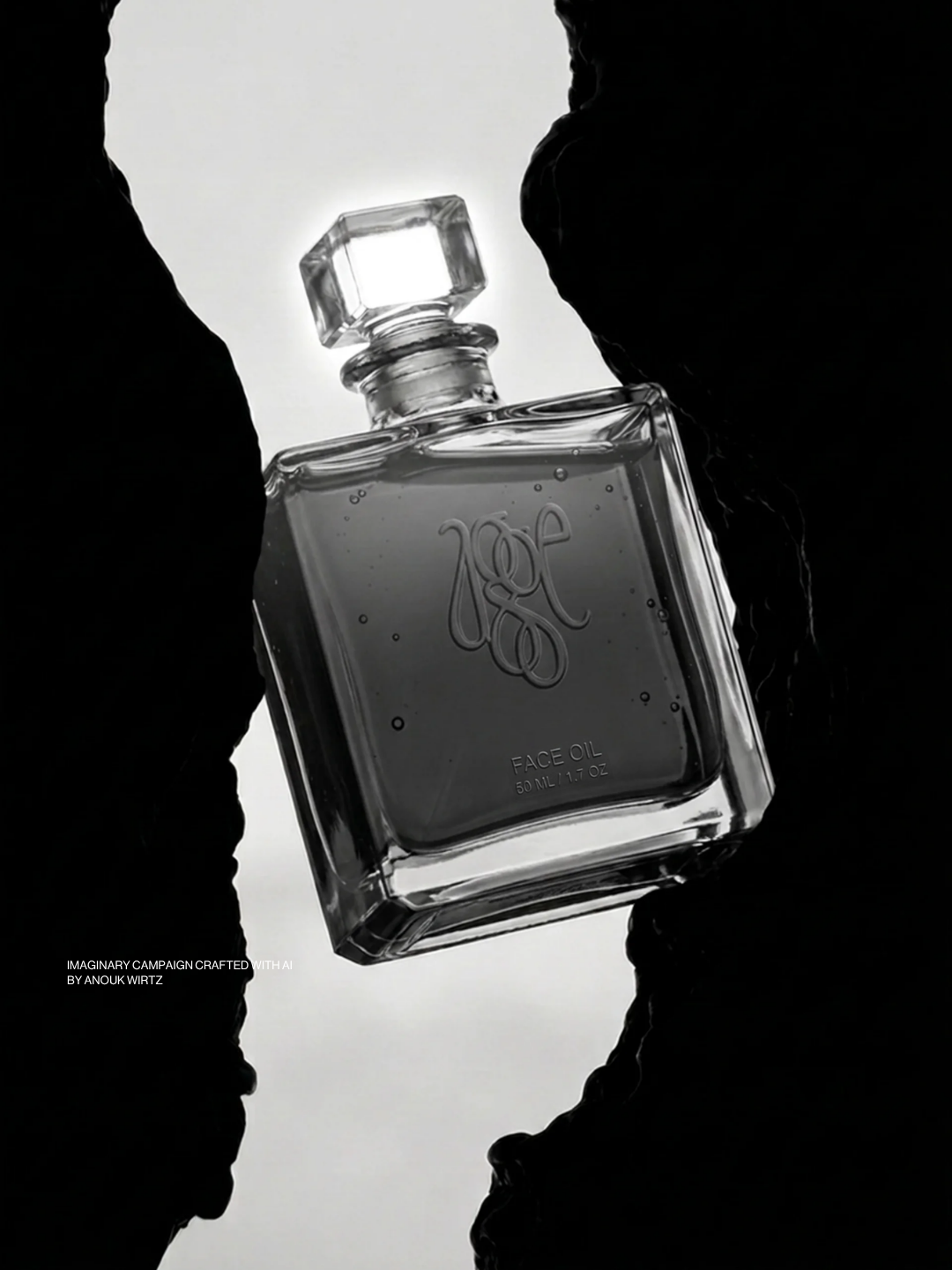
The first g is the age. The second is the care. In the logo they're drawn interlocked, holding onto each other, because one shouldn't come without the other.
The World
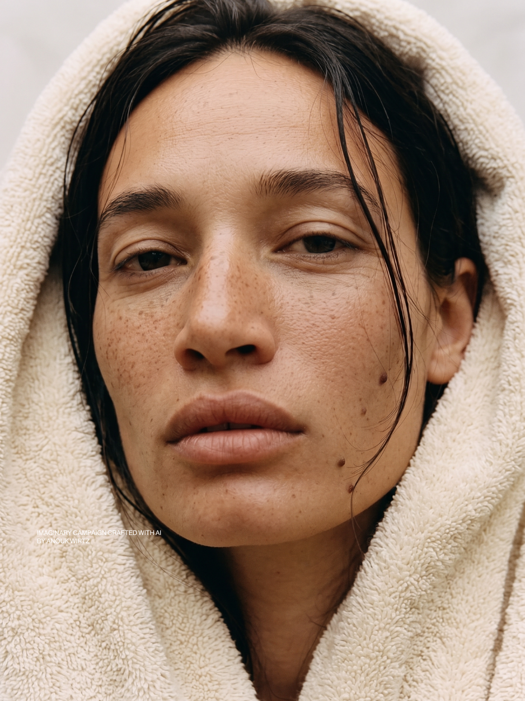
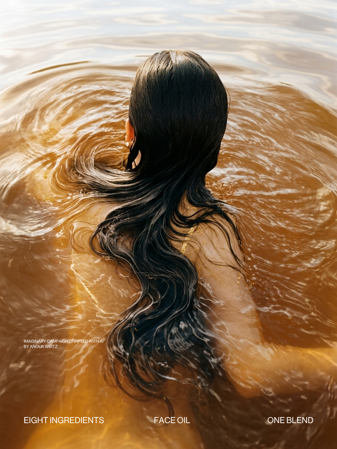
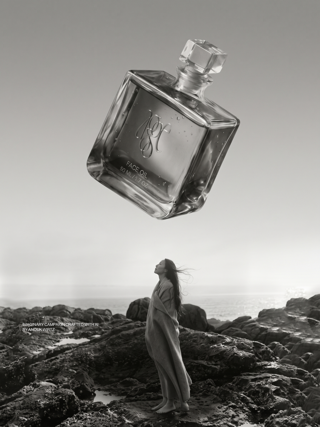
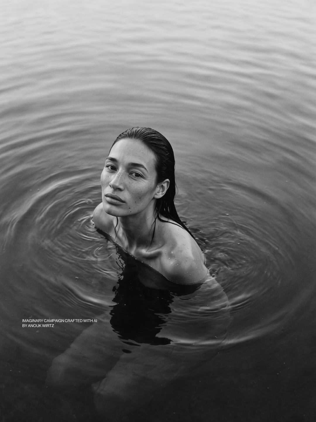
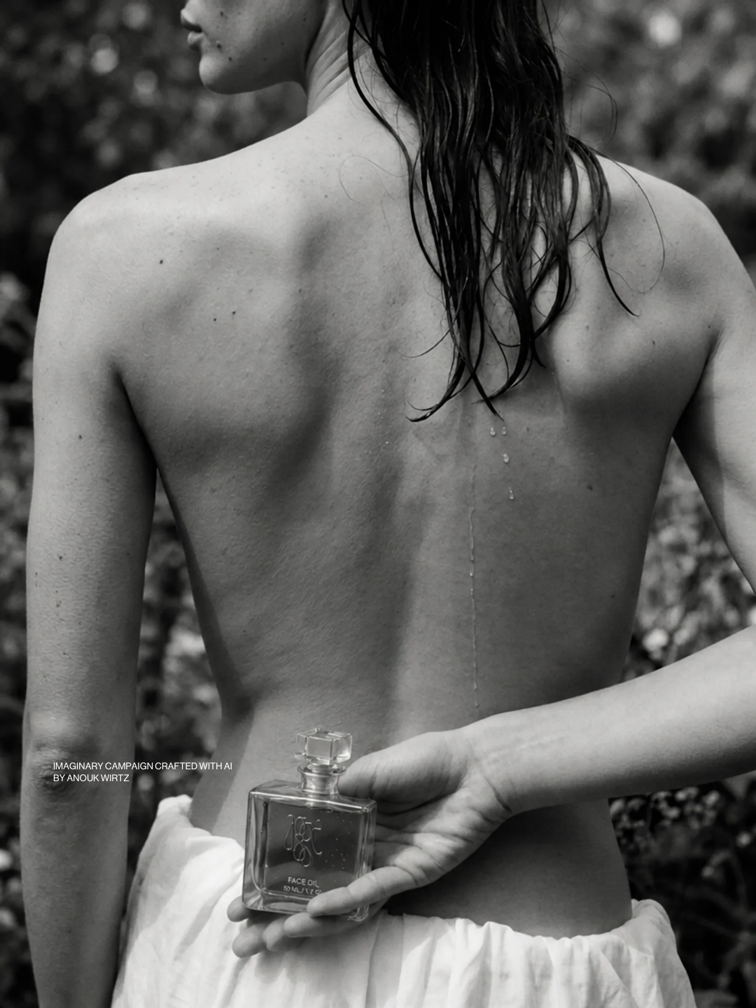
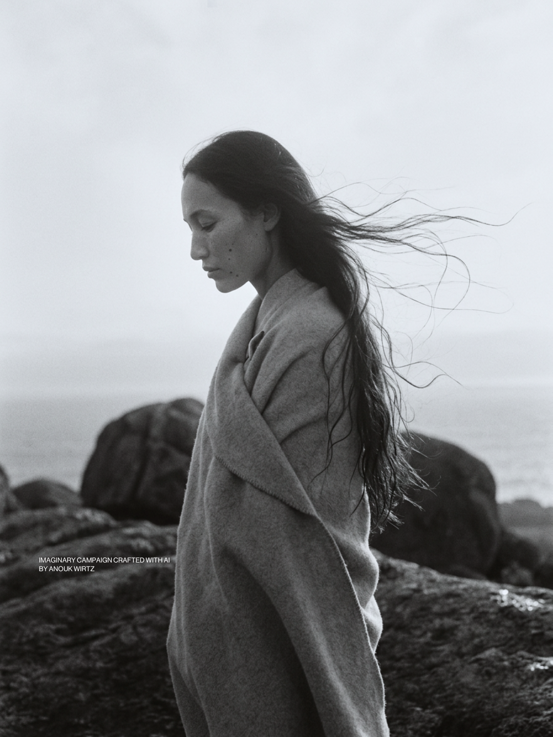
The oils come from seeds, kernels and resin, so the images stay close to nature: rock, open water, wind, a coastline in black and white. The oil is the only warm colour in each frame.
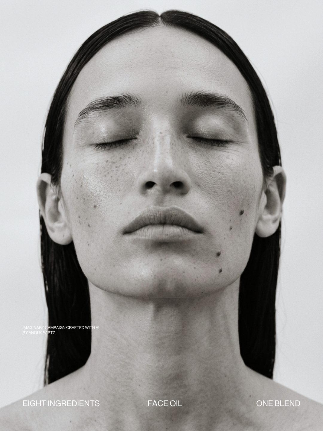
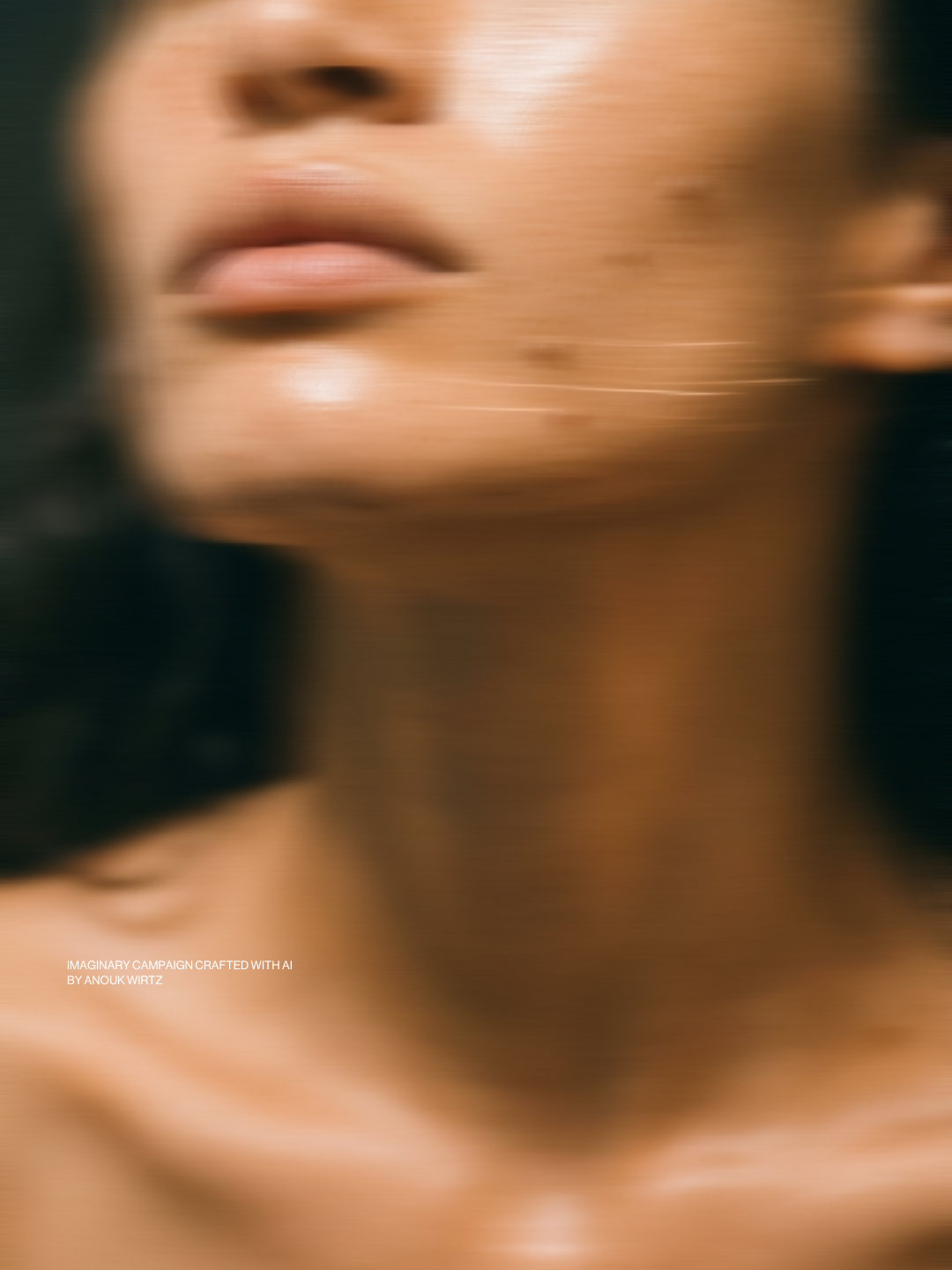
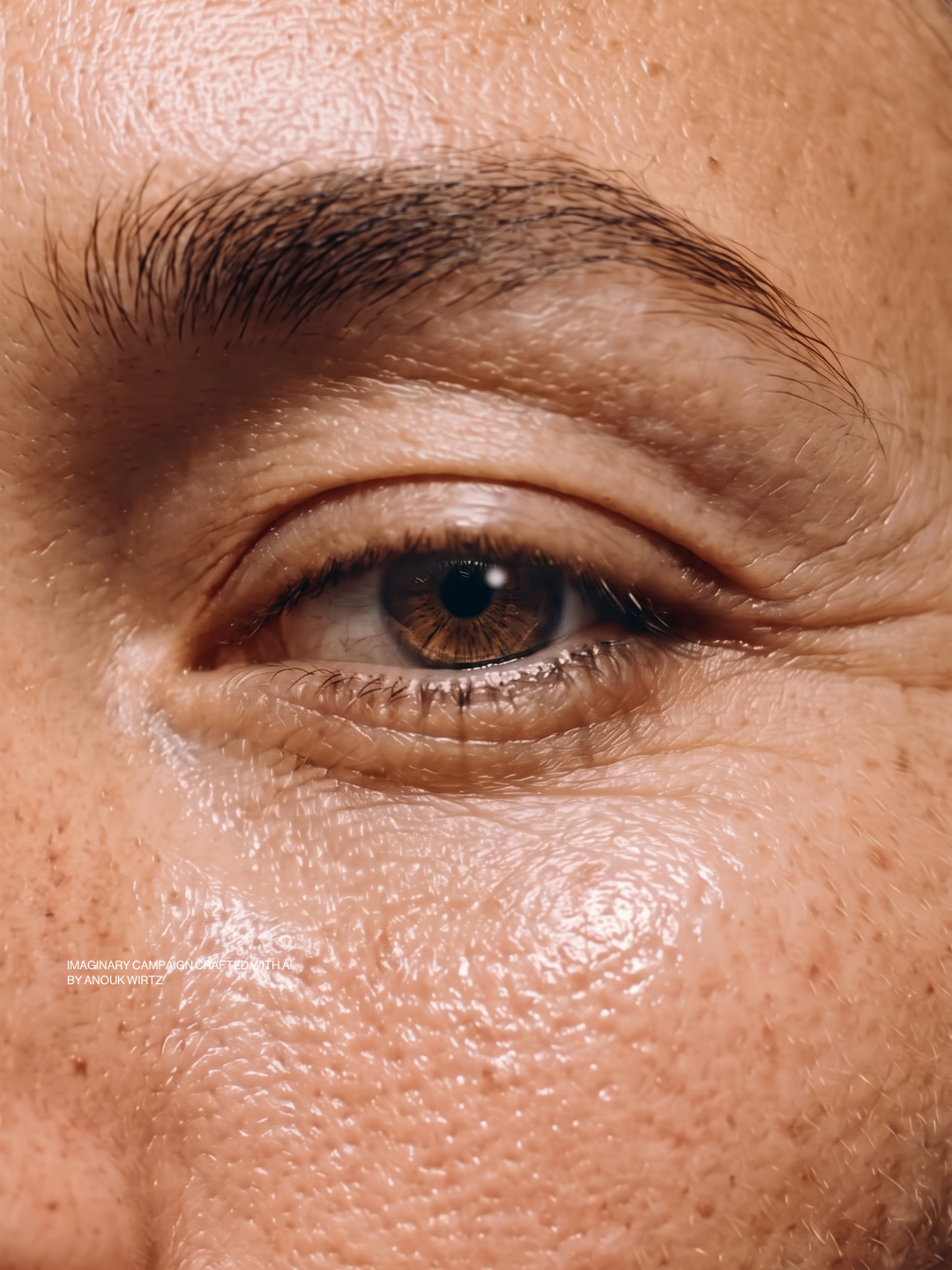
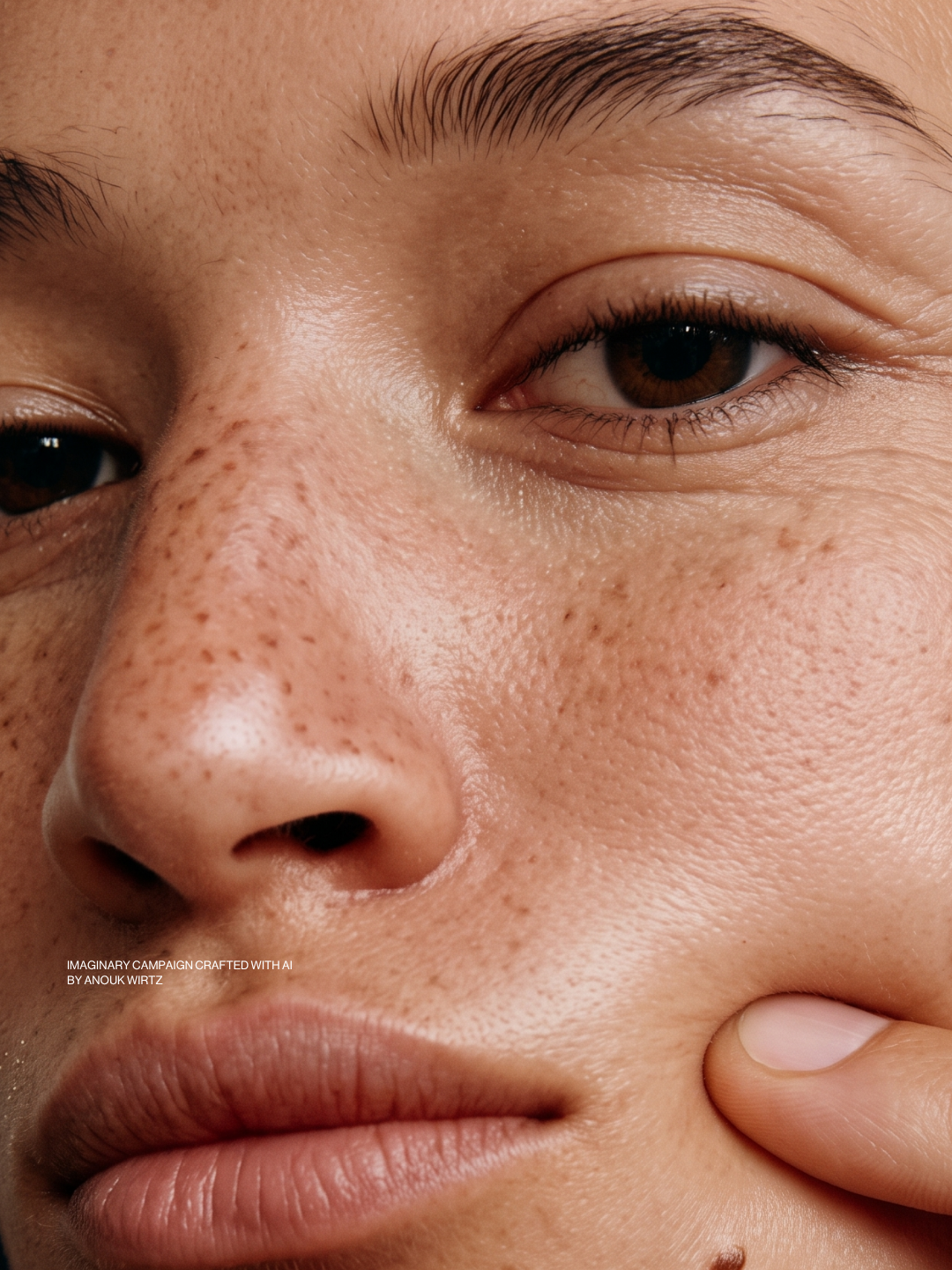
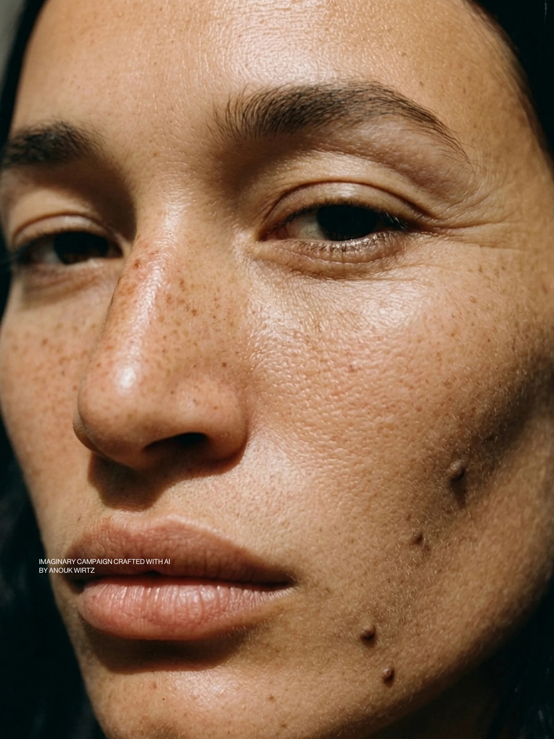
The woman is somewhere past thirty-five. Lines at the eyes, freckles across the nose, a mole she decided to keep. She doesn't want the face she had ten years ago. She wants this one looked after.
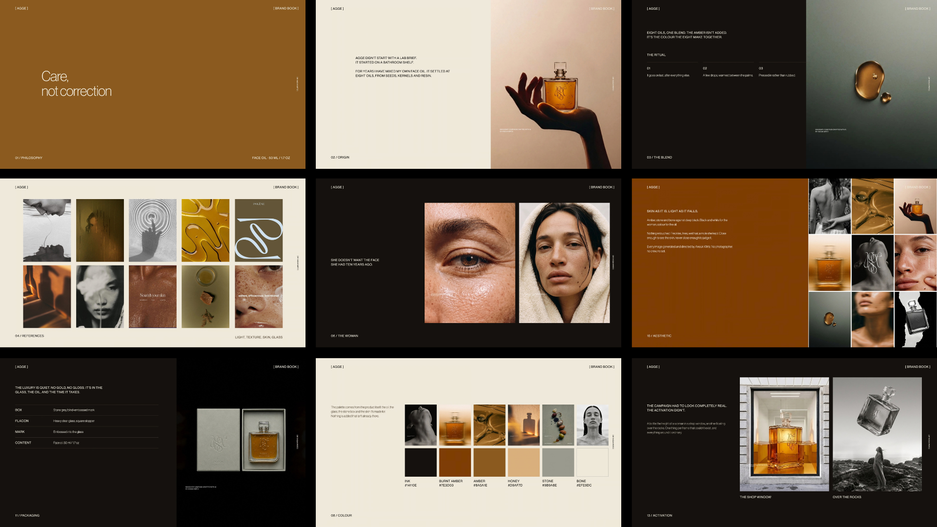
The luxury is quiet. No gold, no gloss. It's in the glass, the oil, and the time it takes.
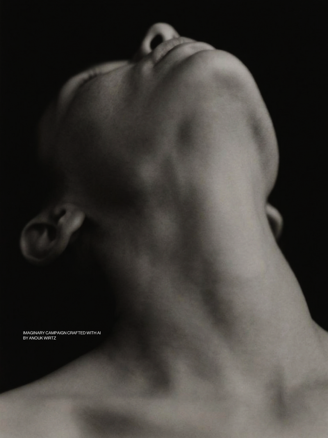
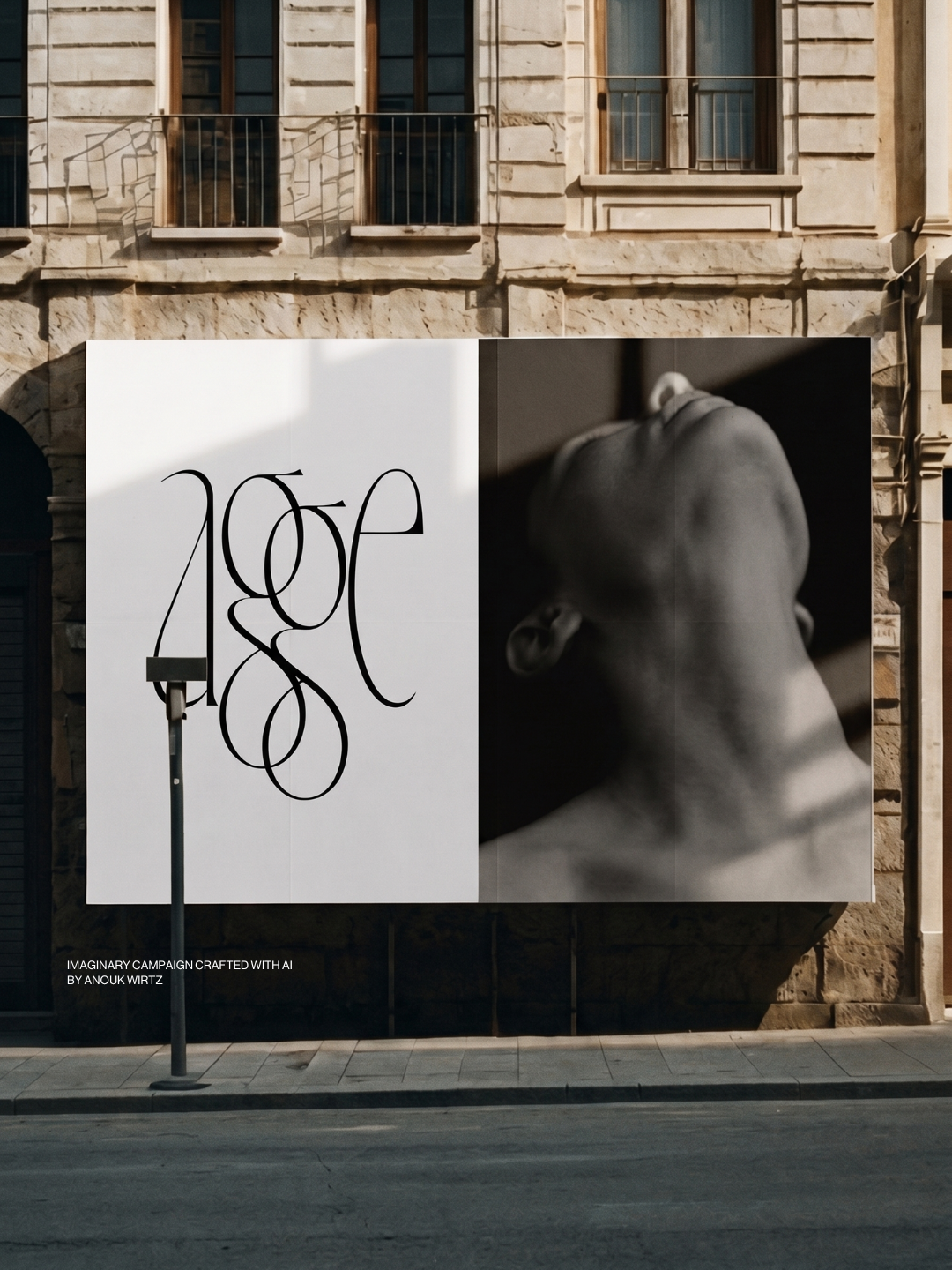
BRAND IDENTITY
ON THE MAKING
I generated and directed every image and video myself. No photographer, no crew, no set.
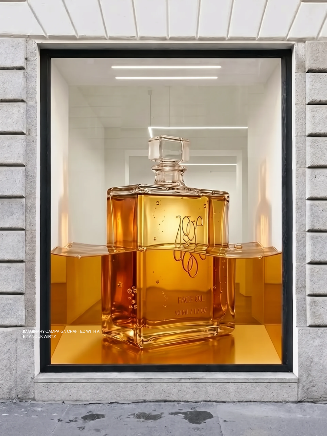
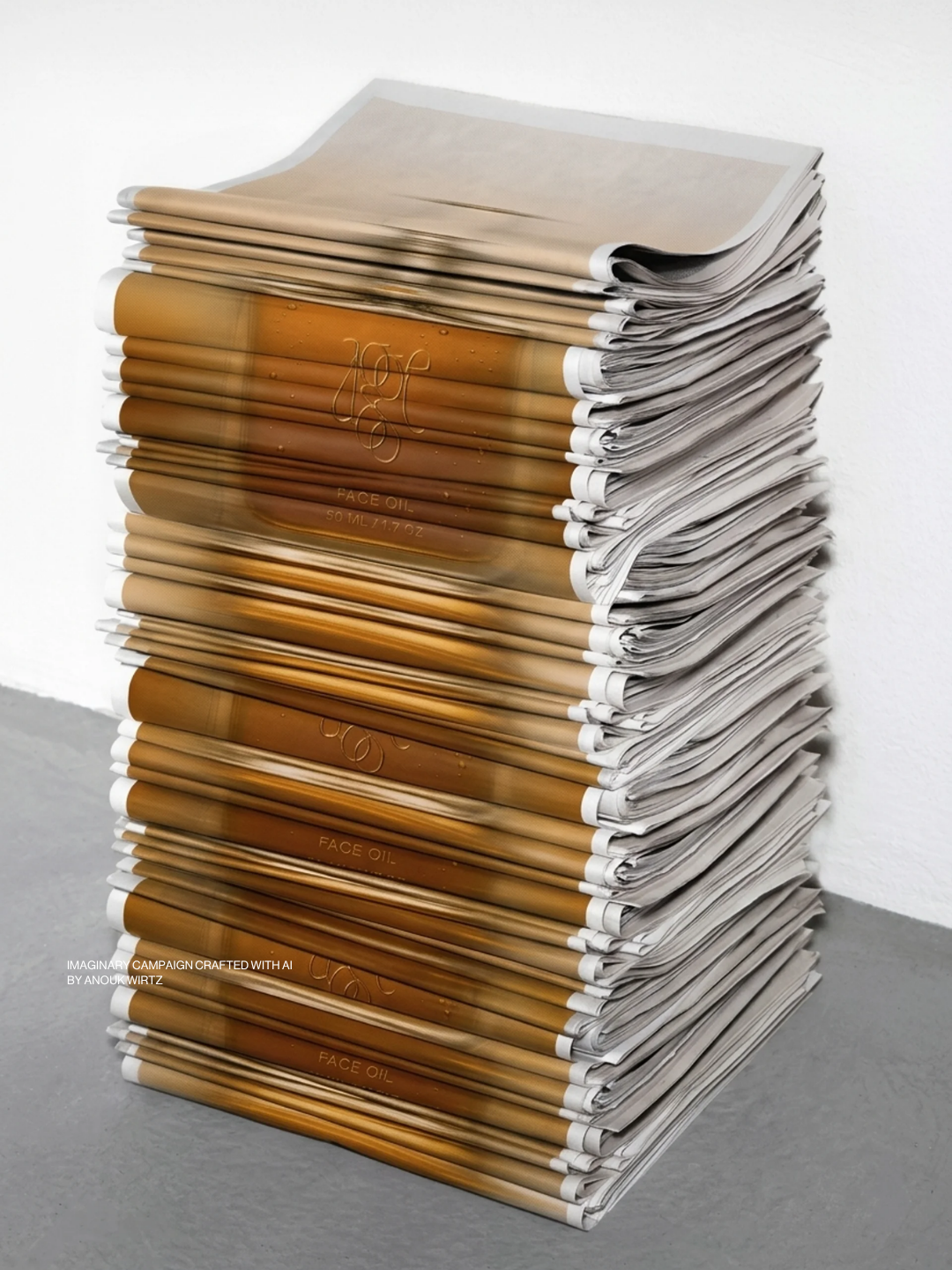
The campaign had to look completely real. The activation didn't. A bottle the height of a woman in a shop window, another floating over the rocks. One thing per frame that couldn't exist, and everything around it ordinary.
Two of the images became short films.